
When we think of ways to improve our website, the first thing we focus on is – How to get more website enquiries. Of course, the website might be bringing a lot of organic traffic, however, how do we convert them into customers?
This is a common mistake that we see business owners or website designers make. It’s easy to get caught up in the moment and forget about little details that can really do wonders for the SEO of your website, and even bring up your website on Google.
Table of Contents
How to Get More Website Enquiries?
So, let’s get onto how to get your website noticed for free on Google. The following 15 tips are really easy to apply in the current scheme of things.
They will help you understand how to get more website sales, aka enquiries, and how to increase online sales if you’re already getting some enquiries.
The main thing we want to accomplish is for you to get (or get more) enquiries from your website.
This is how you can do it.
1. Create Separate Landing Pages for Specific Services
The first and most important thing you should be looking at is your Header. The header should be clean, and clearly show which services you offer and where (if you’re focusing on local SEO).
Just try to put yourself in the positing of the person who came onto your website. You’re completely new to them. They go on your homepage and see that you’re offering dental services, teeth whitening, in-home care services, residential services (we’re speaking theoretically here, I’m completely sure that not many, or any, businesses have this sort of offering).
However, when they see this, they will be confused. They would probably be like – What is happening here? What do they offer? It’s probably a scam, I don’t trust this website.
That’s why you should cluster the services and create separate landing pages for each service—like dental care, senior care, or urgent care – this way you’re making it easier for visitors to find exactly what they need. Plus, your header will be much more organized.
For example:
- A dentist’s landing page can focus solely on teeth whitening services, detailing benefits, patient testimonials, and easy scheduling options.
- A care home landing page might put more attention onto personalized care plans, family visitation policies, and amenities. But also testimonials are important to build trust and build emotional connection.
The clarity improves user experience and can even boost conversions.
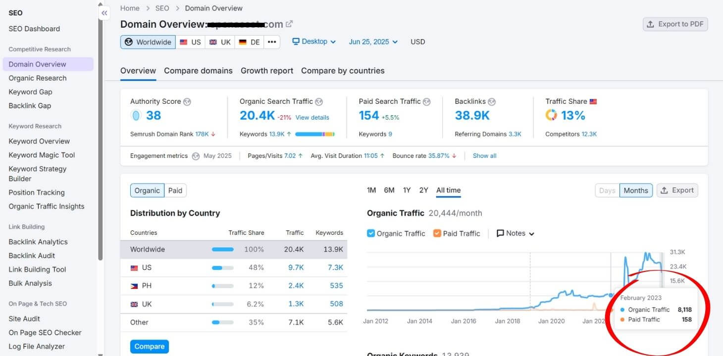
As an e.g. I took a look online for the keyword “dentist in Austin”, and I went to a current number 1 dental website for this keyword on Google, which is Swish at the moment of writing this article. As we can see they have a pretty nice structure, which, of course, Google likes.

2. Clearly Outline the Process
The mentioned niches can be intimidating since there are so many dentists, care homes and even other niches, like real estate or finance. You can help your audience to feel a bit better by outlining the steps they’ll go through when using your service.
For example, this will be a nice outline for dentist industry:
Step 1: Schedule your initial consultation online or by phone.
Step 2: Visit our clinic for an evaluation.
Step 3: Receive a customized treatment plan designed to meet your needs.
3. Use Engaging Visuals Throughout the Page
Healthcare landing pages should strike a balance between professionalism and warmth. However, this really depends on the niche, target audience, and etc.
If your target audience are children’s parents, then you’ll want to make sure that your clinic looks children-friendly, with lots of colors, toys and things that look fun and that their children will like.
Spread visuals like:
- Photos of your friendly staff and clean facilities. (a room with toys and books, if the target audience is children)
- Infographics about recovery timelines or care benefits.
- Images of happy patients with the doctors (with their permission).
Visual content keeps visitors engaged and reduces the likelihood they’ll go away and forget about your website. According to a study on infographics, visuals increase retention of information by 65%.
A really nice example that I found on this topic is the following website:
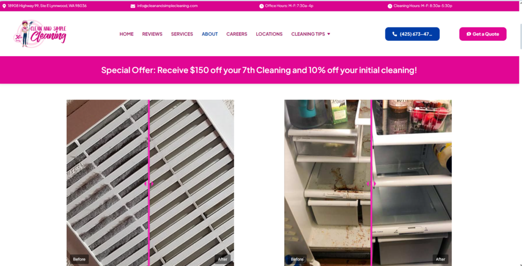
We can easily move the view from before and after their cleaning services, which makes us trust this company. Plus, it’s really easy for the potential clients to see your work and get easily convinced. Another plus they have are the clear CTAs for calling their number or getting a quote.
4. Create Compelling and Conversational Copy
Speak directly to your audience in a way that’s approachable and reassuring. For example, a dentist might write on his website something along the lines:
“Your smile is something everyone notices about you. We know this, and that’s why we offer teeth whitening services that are safe, effective, and designed with your comfort in mind.”
Avoid jargon and focus on patient benefits, such as improved confidence or better health outcomes. You will never get good feedback if you only focus on what YOU offer, the first thing you should be thinking about is how the reader feels when they read it.
5. Define a Clear Objective
What do you want your visitors to do? Do you want them to book an appointment or request a free consultation? You need to make this clear.
Use strong call-to-action (CTA) buttons like:
- “Schedule Your Consultation Now”
- “See If Our Care Home is Right for Your Family”
- “Find a Studio Near You”
These CTAs should be strategically placed, at the top, middle, and bottom of the page. Make sure that the CTAs bring emotion to the reader, make sure it’s not something generical, but something that will make them want to click on this button.
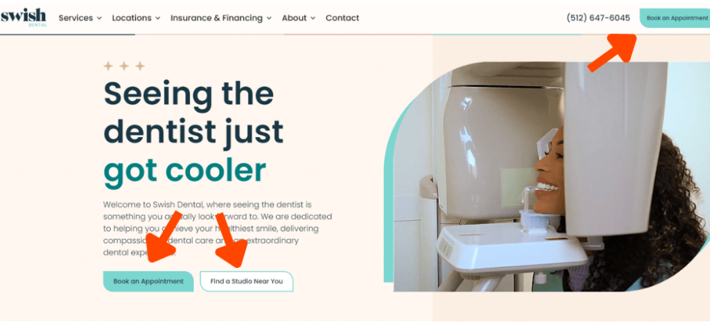
As we can see on the following image, they have multiple CTAs which makes the potential client have plenty of opportunities to get in contact with you. Plus, it’s really easy, and people love when things are easy for them to do, be it finding a studio near them or to return a clothing piece they bought from you. Each niche has different needs.
6. Make Sure That Your Site is Mobile Responsive
In the case of driving traffic to a certain niche, let’s take healthcare as an example. With up to 45% of U.S. citizens report using a mobile phone or tablet to manage their health, a mobile-friendly site is important.
However, this is not just a case for the healthcare niche. Nearly 60% of searches are currently happening on mobile.
So, make sure to test your landing pages on different devices to ensure:
- Quick load times.
- Easy-to-click buttons.
- Readable text.
A clunky mobile experience can cost you potential customers, or in the healthcare industry, patients.
7. Include a Contact Form on Every Page
Make it easy for visitors to get in touch. Instead of requiring them to navigate to a separate “Contact Us” page, embed a form directly on your landing page. Form fields can ask for things as:
- Name.
- Email.
- Phone number.
- Preferred appointment date.
Creating an easy way for people to contact you, will in most cases, make them contact you, even if it’s just to ask questions.
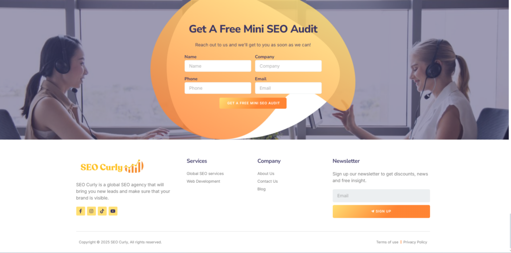
If you haven’t already noticed, it’s really easy to contact us since we have a contact form on all of our pages. Here’s an example:
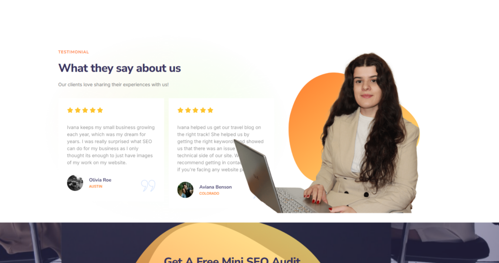
8. Use Testimonials to Build Trust
Patient testimonials are the healthcare equivalent of word-of-mouth referrals. For instance:
“Dr. Smith made me feel completely at ease during my root canal. The entire team was so kind and professional. I’d recommend them to anyone who needs a root canal procedure!”
Displaying real reviews provides social proof, making new patients more likely to trust your services.
Or in our case, it will help you to trust what we do, because we are the best global SEO company that will make sure you get an amazing website and high-quality SEO services, and most importantly, leads.
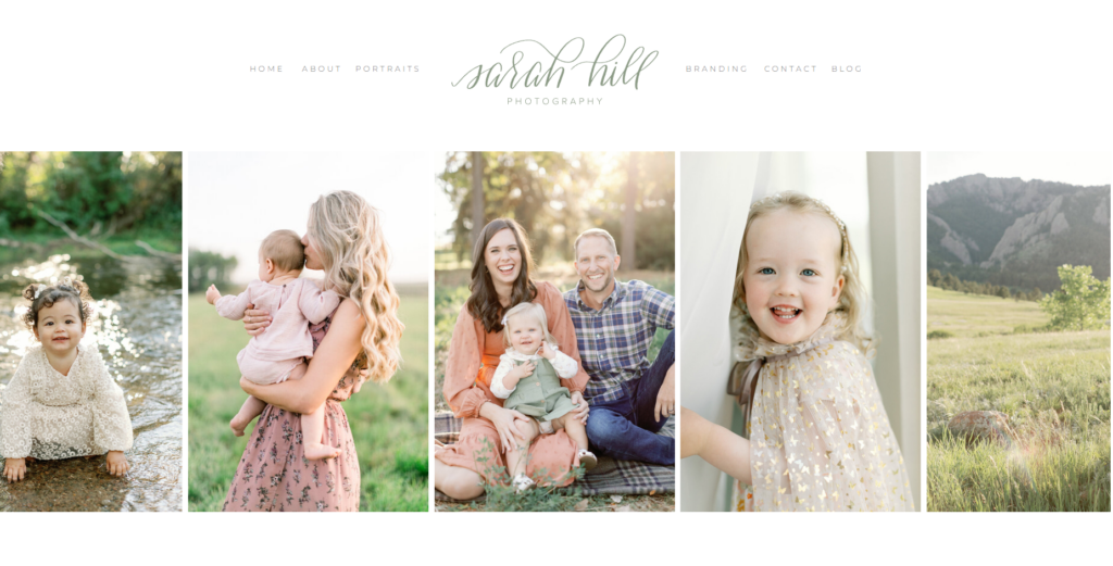
9. Add a Small Gallery of Images
This is not needed for all niches, but it is appreciated by Google to have real images. You can showcase your clinic, care home, or dental office. This is even better if you’re applying it to businesses for let’s say cleaning companies, as they can see the before and after images, and also photographers, so that they can showcase their work.
A small gallery helps readers visualize their experience. Therefore, you should highlight these things depending on your niche:
- Comfortable waiting areas. (in the case of healthcare niche)
- Advanced medical or dental equipment. (in the case of healthcare niche)
- Happy patients (with permission). (in the case of healthcare niche)
- Your best photography work. (in the case of a photography niche)
- Before and after images. (in the cleaning niche, but also in the healthcare niche)
Limit the gallery to 12–15 photos to keep the page clean and focused.
If you’re a photographer, this is reallllyyyy important. Because this showcases your work. We can see here in this example a really nice website with a gallery of images you can scroll trough(Unfortunately, you can’t do that at the moment because this is a screenshot, but if you go to their website you can do it):
10. Create a Short About Us Section
Patients want to know who’s taking care of them. Include a brief “About Us” section with details about your qualifications, experience, and mission.
For example, you can write something along the lines of:
“At Greenfield Care Home, our mission is to provide compassionate, individualized care for seniors in a safe and welcoming environment. With over 15 years of experience, our staff is dedicated to making sure that your loved one feels at home.”
This humanizes your brand and builds credibility.
11. Clearly List What’s Included in Your Services/Products
Transparency is important for any industry. List exactly what the readers can expect from your services/products:
- For dental services: “Comprehensive cleaning, fluoride treatment, and a detailed dental health report.”
- For a care home: “24/7 nursing staff, personalized meal plans, and daily recreational activities.”
- For finance: “Detailed portfolio analysis, personalized investment strategies, and quarterly performance reviews.”
- For real estate: “Comprehensive property listings, virtual tours, and expert guidance throughout the buying or selling process.”
Knowing what’s included reduces uncertainty and creates trust.
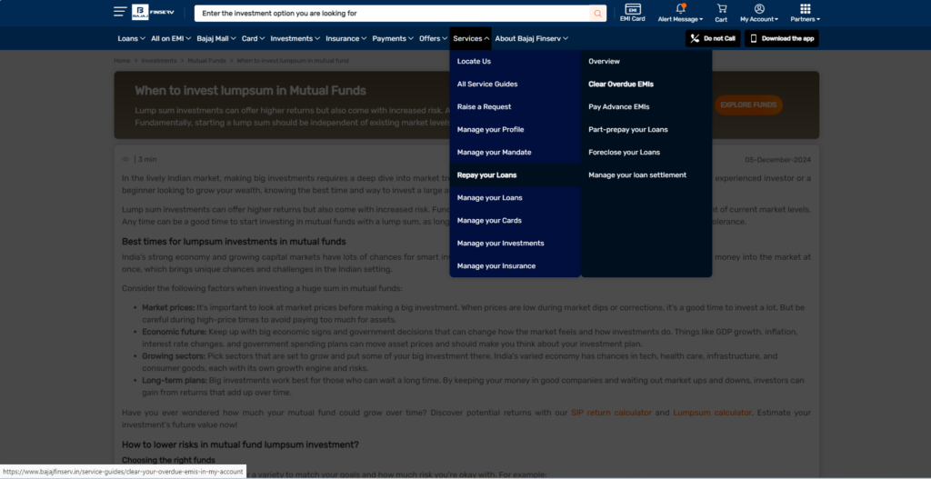
This is an example of a finance website, and we can clearly see which services they offer:
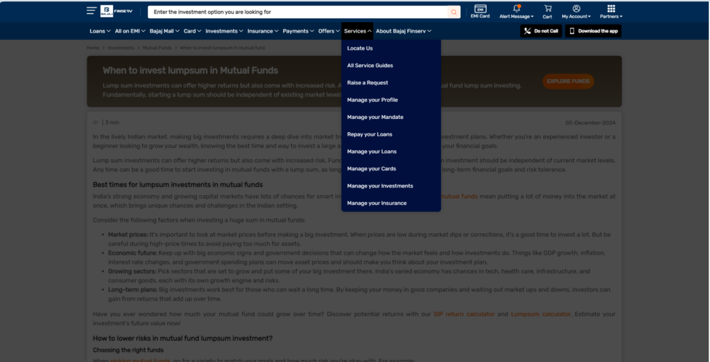
And then once we click for example “Repay your Loans”, it will give you a more specific service they offer regarding repaying loans.
12. Add an FAQ Section
Address common concerns proactively:
- “What insurance plans do you accept?”
- “What are your visiting hours for care homes?”
- “How do I prepare for my first appointment?”
- “What fees are associated with your investment plans?”
- “What documents do I need to start the home-buying process?”
The questions will differ depending on your industry. This saves you time answering emails and reassures patients that you know what you’re talking about.
13. Use Heatmaps to Track Behavior
Install heatmaps to analyze how visitors interact with your page. Are they clicking your CTAs? Are they skipping over important sections?
One of our clients discovered that moving their “Book Now” button higher on the page increased appointments by 18%. Tools like Hotjar or Crazy Egg make it easy to test and optimize your website.
14. Include an Exit-Intent Pop-Up
Don’t let potential patients leave without taking action. Use an exit-intent pop-up to capture their interest.
For example:
“Wait! Schedule your first consultation today and receive 10% off your treatment plan.”
This last-minute effort can convert hesitant visitors into leads.
15. Incorporate Educational Content to Build Authority
In addition to providing information about your services, offer educational content that adds value to your visitors.
For instance:
- A dentist could include a blog or video on the benefits of preventative care and proper flossing techniques.
- A care home might feature guides on recognizing early signs of dementia or tips for selecting the best senior care facility.
- A financial advisor could provide articles on planning for retirement or understanding market trends.
- A real estate agent might include videos on staging your home for sale or guides to navigating the mortgage process.
- A photographer could create tutorials on preparing for a photoshoot or explain the benefits of different photography styles (e.g., lifestyle vs. studio portraits).
Educational content positions you as a trusted expert in your field and can significantly boost credibility.
According to research, consumers are now 131% more likely to buy from a brand immediately after they consume early-stage, educational content. When combined with a good user experience, this approach can create a landing page that informs, engages, and converts.
I found a good example of educational content on this home care page:
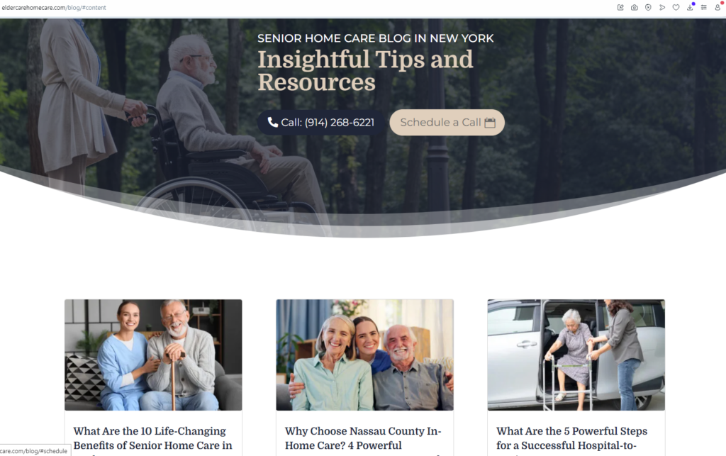
An important thing to keep in mind is that you need to keep posting good high-quality content that gives value to the reader.
How to Get Customers to Your Website?
But wait, there is an important piece missing here. You first need to get people to find your website, if they’re not finding it, then you will need to utilize the best SEO practices.
Okay,… but how to get my website noticed?
It’s really easy, especially if you have basic knowledge of SEO (you can check our blog for some SEO tips). Another thing you should know is how to check website ranking on google free, which is also really easy, but also important, so you know where to start.
Anyway, I hope you learnt how to get more website enquiries, and if you want to know more about how to get customers to your website, check out our blog or our youtube channel, and feel free to ask questions in the comments section. Or just contact us directly.